If you’ve ever tried to understand or scale your lead generation efforts using GA4 and ended up lost in a maze of tabs, events, and broken reports—you’re not alone.
Most business owners struggle to answer the same questions:
- Where are my best leads really coming from?
- What’s actually working in my campaigns?
- What do I need to do to get more quality leads?
And to fix that, we at nn.partners built this GA4 Lead Gen dashboard:
👉 Get the GA4 Lead Gen Dashboard
This is a GA4-powered Looker Studio report for lead generation businesses. It shows you where your leads are coming from, what users are doing on your site, and how well your marketing efforts are converting visitors into actual sales.
And the best part? It’s clear, intuitive, and built with one goal in mind: to help you make better, smarter decisions with data, faster.
Let’s walk through what it does.
The Lead Gen Dashboard, at a Glance
From the moment you connect your GA4 property, the dashboard updates with your real-time data. On the left side, you’ll find filters to segment by date, traffic source, device, channel, or domain. And the navigation menu lets you jump between six focused sections:
- Overview
- Funnel
- Geography
- Demography
- Landing Pages
- Time
Each one is designed to help you answer a specific question about your lead performance—without needing a data team to explain it.
Page 1: The Overview
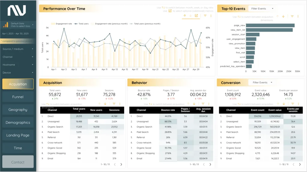
The Overview page is your pulse check.
At the top, you get a clear view of how traffic and engagement are trending. Total users are shown day-by-day in a clean line chart, with engagement rate layered in beneath—so you can spot patterns and evaluate traffic quality at a glance.
To the right, the Top Events chart highlights what users are actually doing: form submissions, clicks, downloads, and more.
And at the bottom, three panels break down your funnel stages:
Acquisition — Where visitors are coming from
Behavior — How they’re interacting with your site
Conversion — Which channels drive the most leads
Each section ties directly into your real-world KPIs. No guesswork, just data that tells a story.
Page 2: Funnel
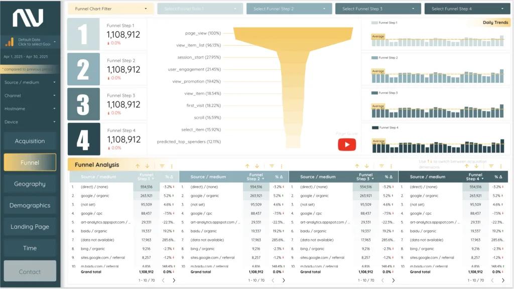
The Funnel page lets you visualize your entire lead journey—from first click to conversion.
You can fully customize each step using your own GA4 events, like form_submit, email_click, demo_request, or whatever matches your setup.
The funnel chart shows drop-offs between each stage. Bar graphs track those same steps over time, so you can see how performance shifts day-to-day or week-to-week.
And if you want to break it down by traffic source? There’s a full table underneath that lets you segment by channel, campaign, country, device, and more.
This is where you find out what’s working—and where leads are slipping through the cracks.
Page 3: Geography
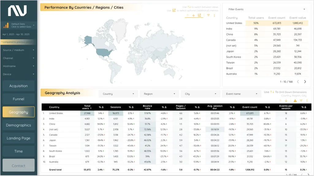
Not all traffic is created equal—and the Geography page proves it.
At the top, an interactive map shows where your users are coming from. Darker colors mean higher activity. You can drill down by country, region, or city.
To the right, a summary table ranks each region by user count and event activity. This helps you identify your strongest markets and find overlooked opportunities.
At the bottom, the detailed Geo Analysis table gives you a full breakdown—sortable and filterable by any major location metric.
Page 4: Demographics
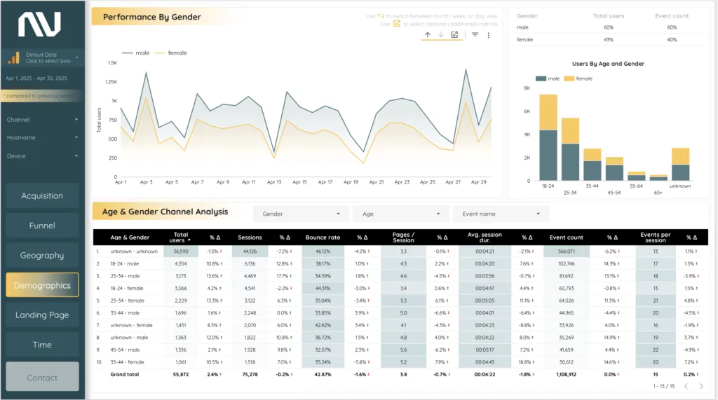
This page helps you understand who your audience actually is.
It starts with a gender-based trend chart that shows how user volume shifts between male and female users over time.
Next to it, a bar chart breaks things down by age group and gender—so you can see which segments are most engaged, and which ones may need a different message.
Below, a full demographic performance table shows everything: event count, session data, user volume—broken down by age and gender. Use it to shape your content, targeting, and campaigns based on actual user behavior.
Page 5: Landing Pages
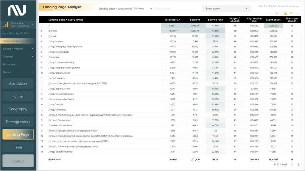
Your website’s front doors.
This page highlights which landing pages are bringing in traffic—and how those pages are performing.
The main table shows user volume, engagement, and conversion for each landing page URL. You can filter by specific pages, test variations, or campaign entry points.
Want to know which pages are working? Which ones are bouncing users out? This is where you find out.
Page 6: Time
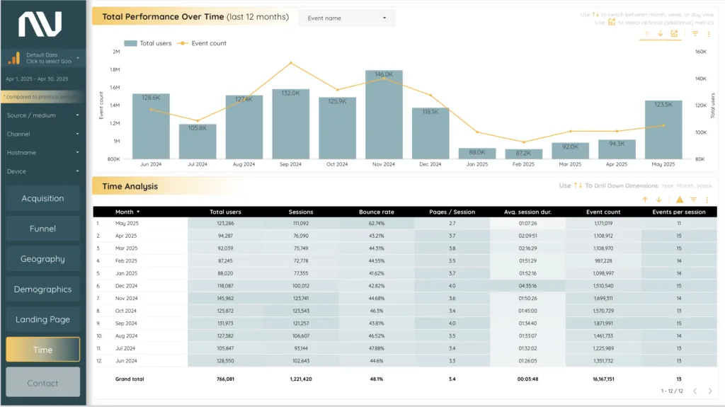
Everything moves fast—but some insights only show up over time.
The Time page shows your performance across weeks and months. The top chart compares total users and event activity month by month, helping you spot seasonality, shifts, or slow-downs before they become a problem.
Below, a time-based table gives you full control over your analysis. You can toggle between day, week, and month views depending on how deep you want to go.
It’s perfect for reporting, trend analysis, or spotting patterns that tie back to specific campaigns or seasons.
Why This GA4 Lead Gen Dashboard Works
Most GA4 reports overwhelm you with data but leave you guessing what to do next.
This dashboard flips that.
It turns chaos into clarity—showing you what’s working, what’s not, and where to focus next.
Everything is real-time, pulled directly from your GA4 account, and designed to be immediately actionable.
You don’t need custom SQL queries. You don’t need a data analyst. You just need the right dashboard.
Key Benefits
- Real-Time GA4 Integration Get live insights from your own website data.
- Custom Funnel Analysis Build and track any funnel using your real GA4 events.
- Demographic & Geographic Reporting Know who your users are, where they’re coming from, and how they behave.
- Landing Page Optimization See which entry points are driving leads—and which aren’t pulling their weight.
- Flexible Filtering & Drill-Downs Segment your data by campaign, source, medium, device, country, city, and more.
- Actionable, Not Just Informational This isn’t just another dashboard—it’s a tool to help you improve performance right now.
The Bottom Line
If you’re running lead generation campaigns and you’re tired of flying blind in GA4, this lead gen dashboard is for you.
It shows you exactly where your leads come from, how they move through your site, and what needs to change to get more of them.
No fluff. No friction. Just data that makes sense—and drives growth.
👉 Get the GA4 Lead Gen Dashboard